How to think about a restaurant logo and its design system
Start from the name, not the cuisine. Decode what the name means and sounds like, pick one visual idea from it, and build the wordmark around that idea. Keep two colours and two fonts, make sure it reads at 32 pixels and on a storefront, then grow the whole design system from the logo.
Most restaurant logos look the same because they start in the same place: a fork, a knife, a chef’s hat, maybe a ribbon. Put twenty of them side by side and you cannot tell the pizza place from the biryani house.
The logos that stand out start somewhere else. They start with the name.
We collected some of the best modern restaurant identities from Behance and Pinterest on an inspiration board, and turned what they have in common into a process. Then we used it on a real brief: Zaika, the food court inside Jumpoline, a trampoline park. This is how we think about it.
Why start with the name?
Because the name is the one thing nobody else has. Cuisine is shared by thousands of restaurants. Your name is yours.
Before drawing anything, decode it:
- What does it mean? Translate it. Zaika is Hindi and Urdu for taste, the kind of flavour you remember.
- How does it feel? Warm, homely, regal, playful, street? Zaika inside a trampoline park should feel desi, family-warm and bouncy.
- What objects hide in it? List every ingredient, utensil, animal or shape the name can become.
- Which letters can carry an idea? Round letters like o, c, d and a can become a plate, a bowl or a tomato. Tall ones like i, l and t can become a fork, a spoon or a chilli. The dot of an i can become almost anything small and round.
- How long is it? Short names suit a wordmark with one clever letter. Longer names need a small symbol above.
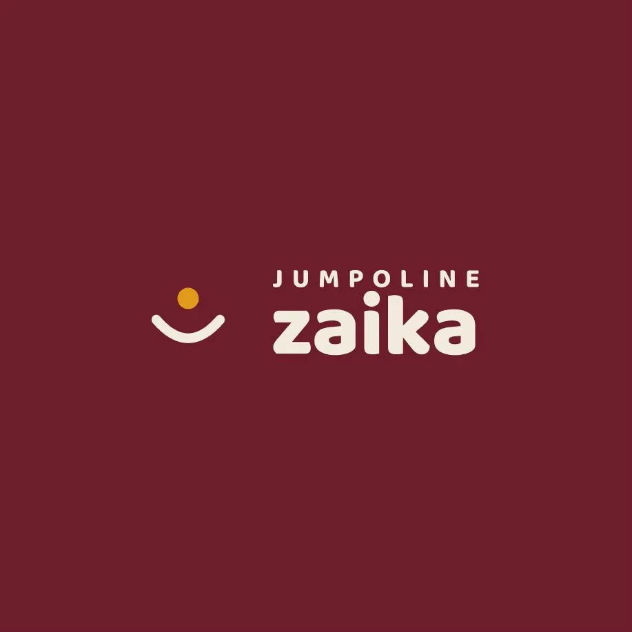
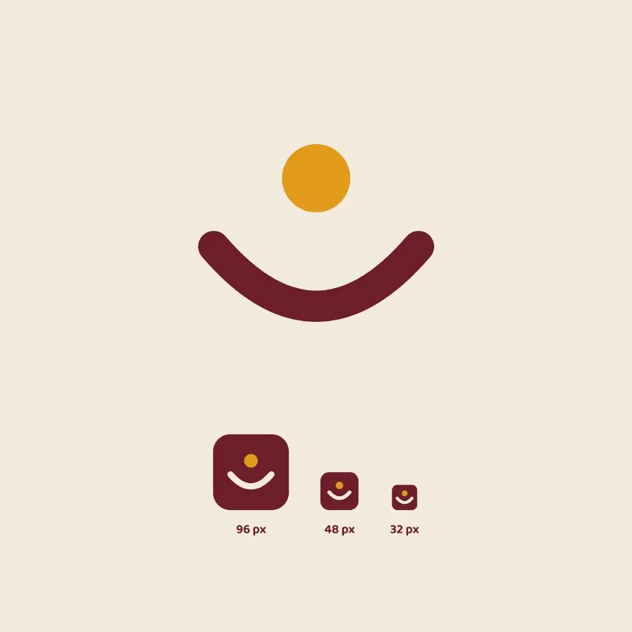
For Zaika, the idea came from the setting as much as the word: a jump. A saffron dot in mid-air above an arc, which reads as a ball on a trampoline, a smile, and a spoonful of something good all at once.
Which kind of logo should you choose?
The strongest restaurant logos fall into about eight families. Pick one, two at most.
| Type | What it looks like | Suits |
|---|---|---|
| Letter and object | One letter becomes a food or utensil | Short names, casual dining |
| Emblem above the name | A small fine-line symbol over a refined wordmark | Premium and regional cuisines |
| Negative space | A fork or flame cut out of a bold shape | Brands that need a strong icon |
| Retro chunky type | Heavy, soft-cornered, slightly quirky letters | Street food, burgers, cafés |
| Editorial serif | Elegant high-contrast type, lots of space | Fine dining, wine bars |
| Script signature | A flowing hand-written name | Trattorias, bistros, bakeries |
| Cultural ornament | A simple geometric motif from the cuisine | Indian, Mexican, Japanese |
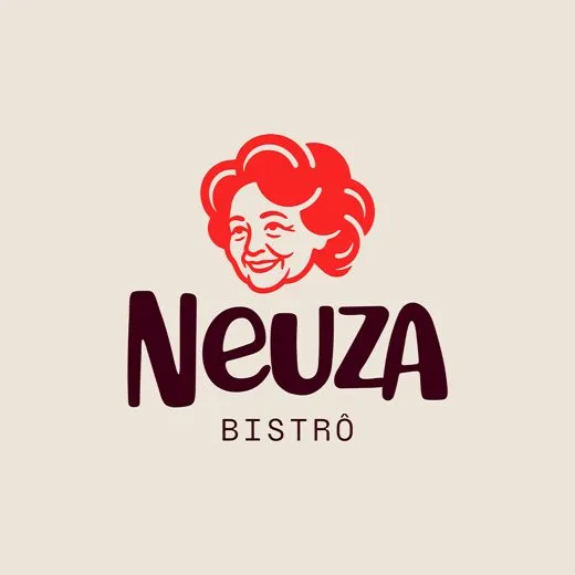
| Flat character | A one-colour face or figure above the name | Family-run, heritage kitchens |
Zaika is an emblem with the name beside it: a simple, friendly symbol and a soft rounded wordmark.
What do the best examples look like?
These come from our restaurant logo inspiration board, one row per type. Each is credited to the designer or studio that shared it.
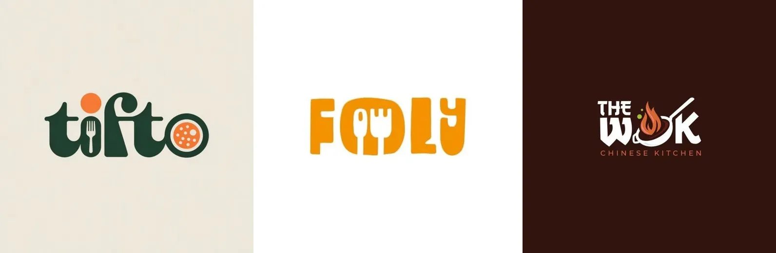
Letter and object. Tifto turns the i into a fork and the o into a pizza. Foly swaps letters for a fork and spoon. The Wok puts a wok and flame inside the W. Tifto by Digital Designs, Foly by Mojunify, The Wok by Esolz Technologies.
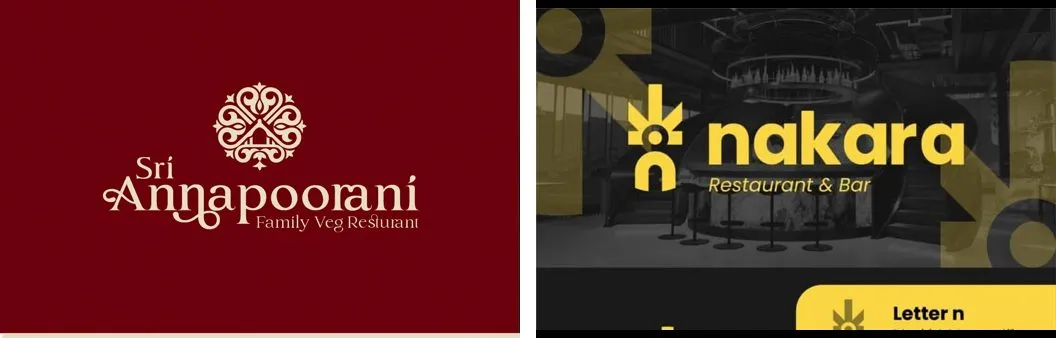
Emblem above or beside the name. A small, fine symbol sits with a refined wordmark. Sri Annapoorani by Idea Inside Designing Agency, Nakara by Fylonary.
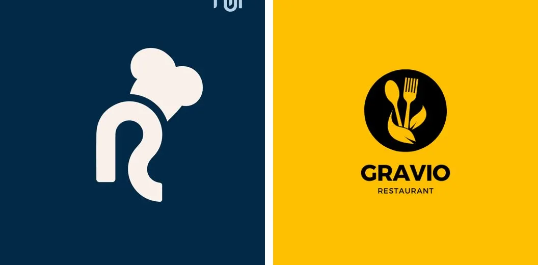
Negative space. A bold solid shape with the idea carved into it: an R that wears a chef’s hat, a fork and spoon cut from a circle. R mark by aushdesign, Gravio, a Canva template by Arka Creatives.
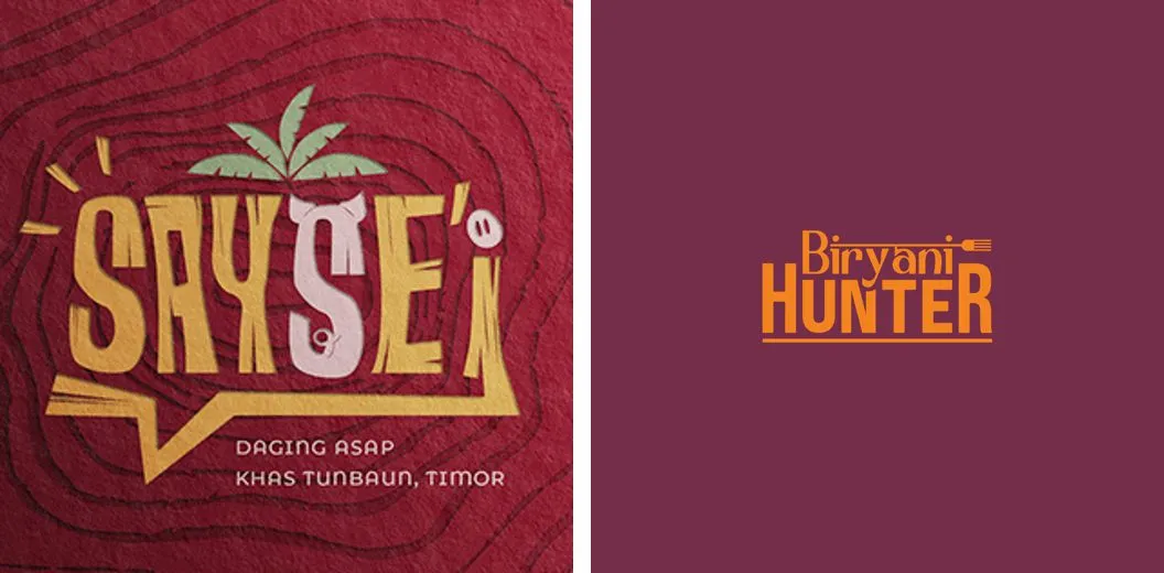
Retro chunky type. Heavy, playful letters with one wink of detail. SaySei by Michelle Bon (Pro Brand Design), Biryani Hunter by The Lion Studios.
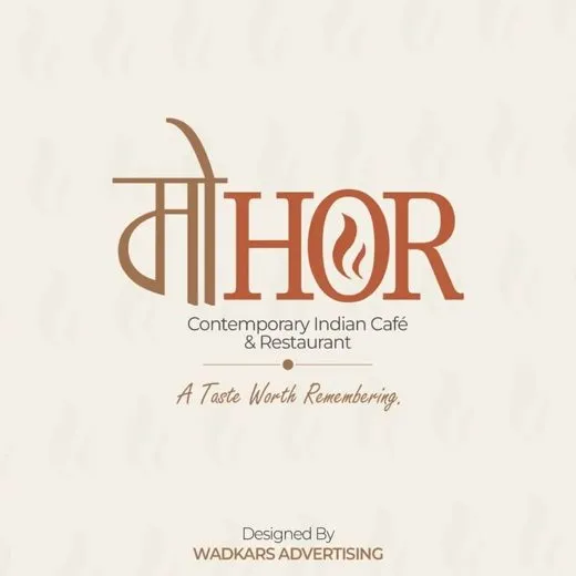
Editorial type. Restraint and contrast; Mohor mixes Devanagari and a serif into one word. Mohor by Wadkar’s Advertising.
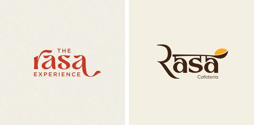
Script signature. A flowing name with one swash, and a spoon hidden in the a. The Rasa Experience via Marlowe Lane, Rasa Cafeteria by Snehit Yadav.
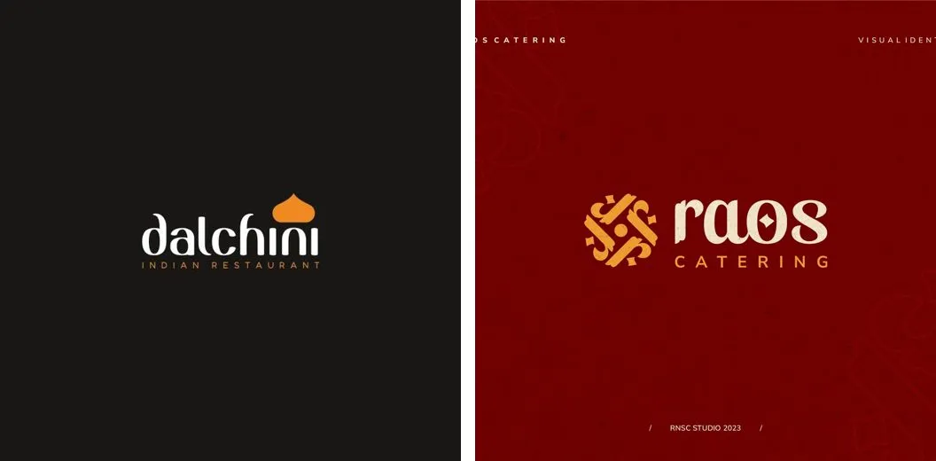
Cultural ornament. One simple motif from the cuisine’s world: an onion dome as the dot of the i, a geometric pattern beside the name. Dalchini from a 99designs contest, Raos by RNSC Studio.
Flat character. A one-colour face that makes the place feel like someone’s kitchen. Neuza Bistrô by sandrin.design.
What rules make a logo work?
A handful, and they are strict.
- One idea only. One clever letter, or one symbol, or one character. If it needs explaining, it fails.
- The name is the hero. The wordmark takes up most of the width. The symbol supports it.
- One typeface personality. Editorial serif, friendly sans, chunky display or script. Commit to one.
- Two colours, plus the background. Flat colour only. It must also work in plain black and plain white.
- It must read at 32 pixels and on a three-metre sign. That rules out hairlines and tiny details.
- Avoid the clichés. No chef’s hat with crossed cutlery, no badge stuffed with stars and dates, no realistic food, no gradients, glows or shadows.
How do you build the design system from the logo?
The logo is not the brand. It is the seed. Everything else should grow from the same idea, so a cup, a menu and an Instagram post all feel like one place.
Colour
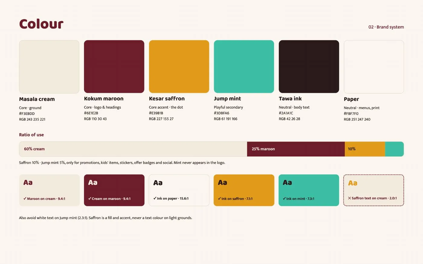
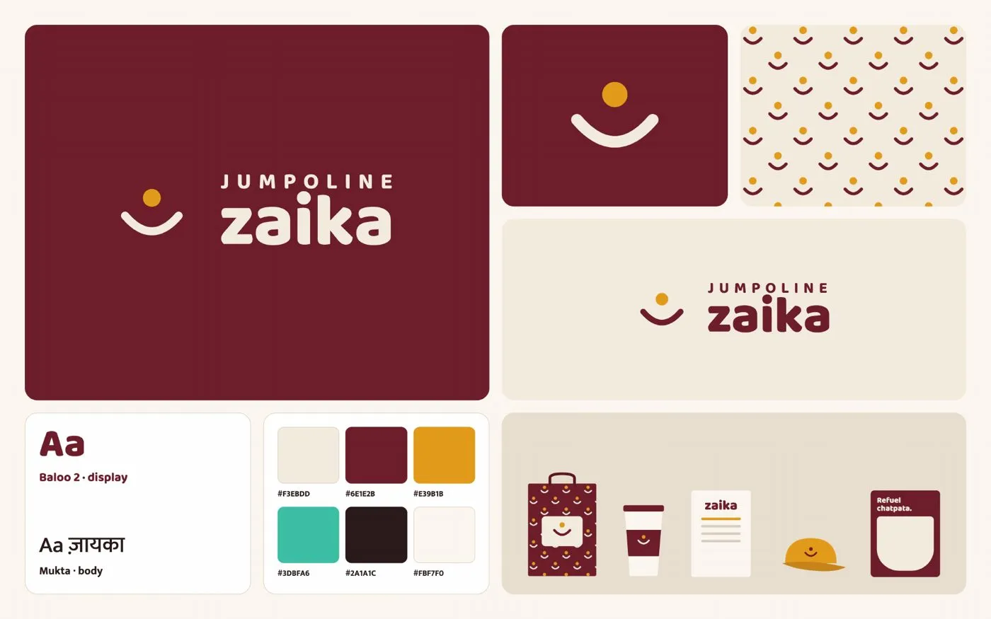
Pick a palette from the mood, not from a trend. Zaika uses masala cream as the ground, kokum maroon for the logo and headings, and kesar saffron for the dot: roughly 60% cream, 25% maroon, 10% saffron. Then one playful extra, Jump mint, used only for promotions, kids’ items and stickers, and never inside the logo. Every text pairing is checked for contrast; saffron text on cream fails, so saffron is only ever a fill.
Fonts
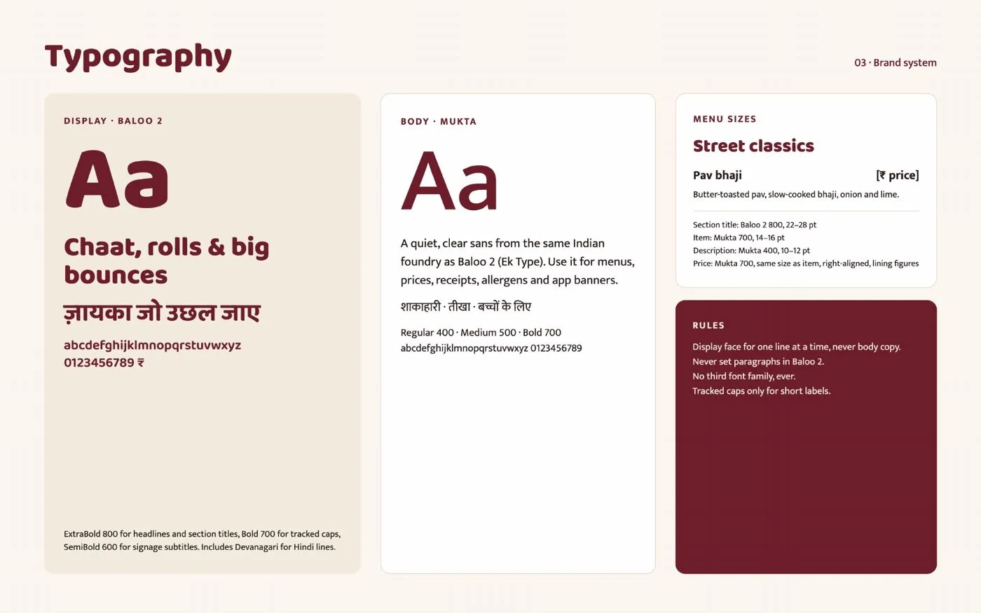
Two families are enough. A display face for headlines, section titles and signs, and a quiet sans for menus, prices and receipts. Zaika uses Baloo 2 for display and Mukta for body, both free Google Fonts from the same Indian foundry, both with Devanagari so Hindi lines match. The rules matter as much as the choice: display for one line at a time, never for paragraphs, and never a third font.
Logo versions
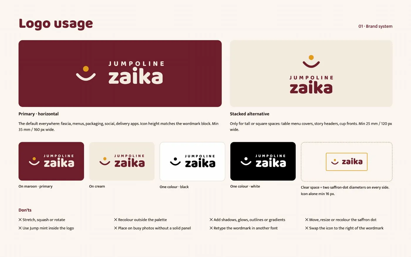
A logo needs a few shapes for different spaces: a horizontal version for fascias, receipts and delivery-app headers, a stacked one for cup fronts and menu covers, and the icon alone for the social avatar and stamps. Set a clear space around it and a minimum size, then test the icon small. Zaika’s dot-and-arc still reads at 32 pixels.
Graphic elements
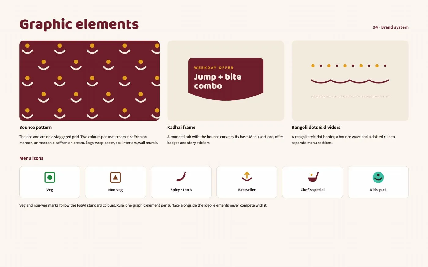
Pull three to five reusable pieces out of the logo idea. Zaika has a bounce pattern of dots and arcs for bags and box interiors, a kadhai-shaped frame for offers, rangoli-dot dividers for menus, and a set of menu icons for veg, non-veg, spice level and kids’ picks. One element per surface, alongside the logo, and none of them ever competes with it.
Photography and voice
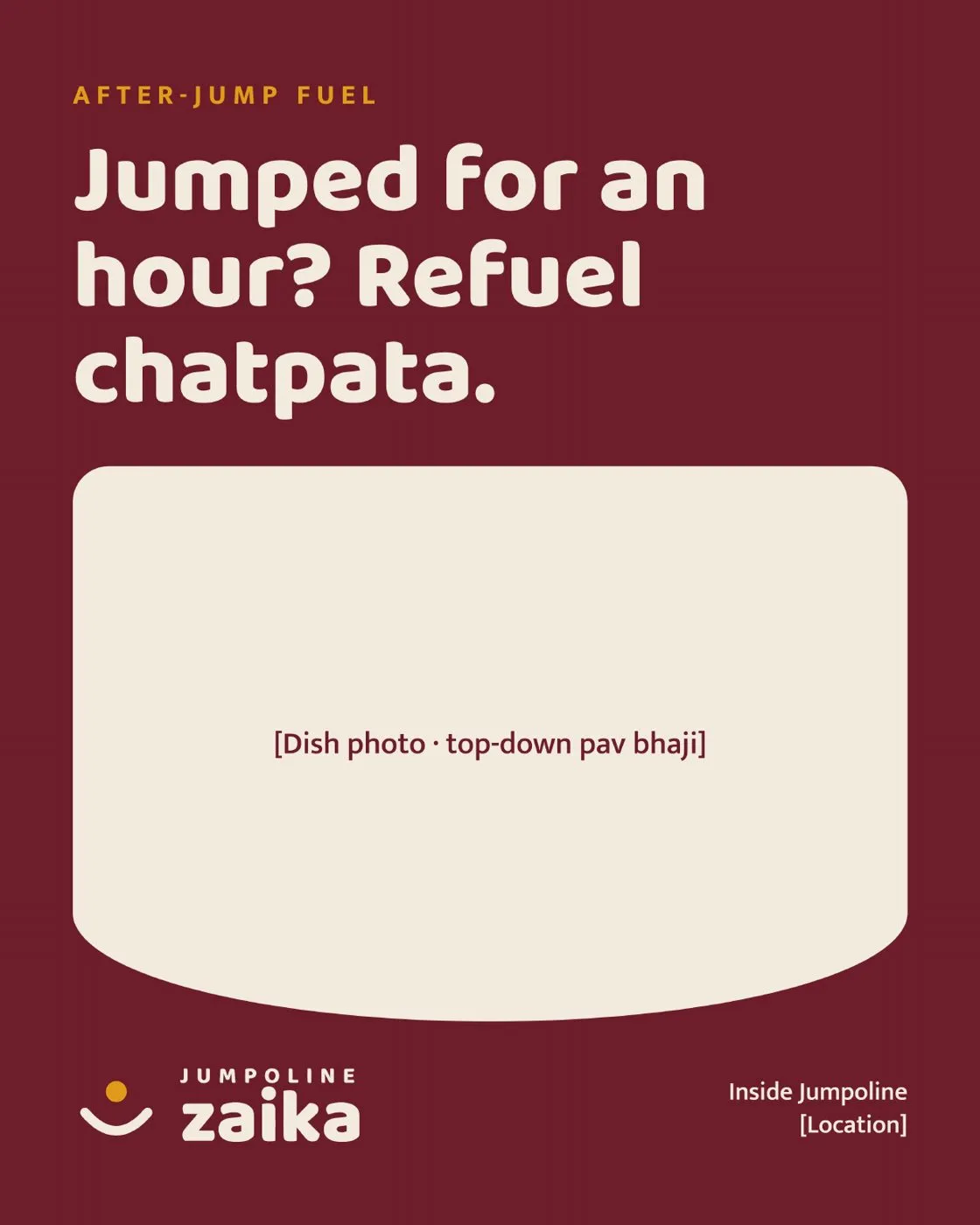
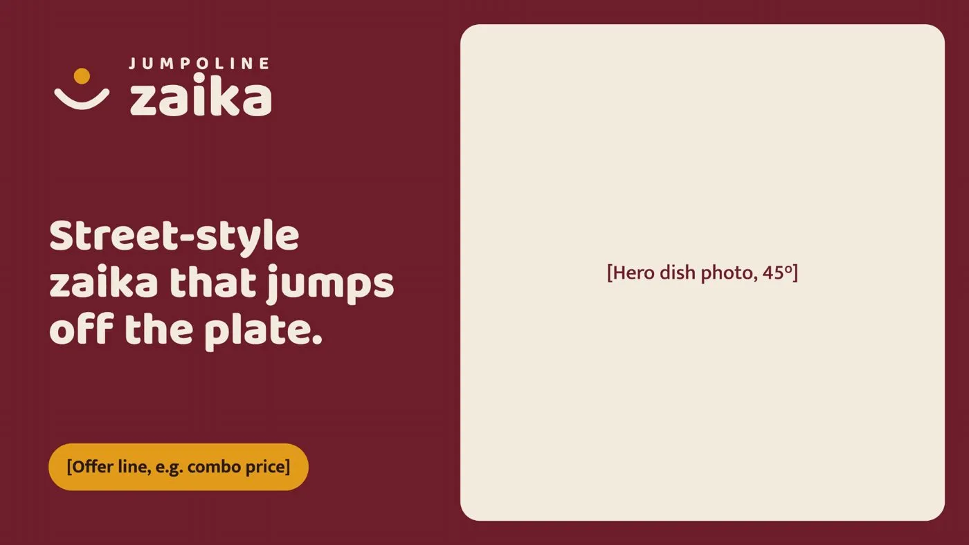
Write down how food is photographed and how the brand talks, before anyone shoots or writes a caption. For Zaika: warm natural side light, top-down for chaat and platters, 45 degrees for rolls and drinks, brass and banana leaf, real crumbs and hands in frame. The voice is bouncy, desi and family-warm, English first with Hindi where it comes naturally: “Street-style zaika that jumps off the plate.”
Where does the system show up?
Everywhere a customer touches the brand. Decide, for each one, which logo version, which background and which graphic element it uses.
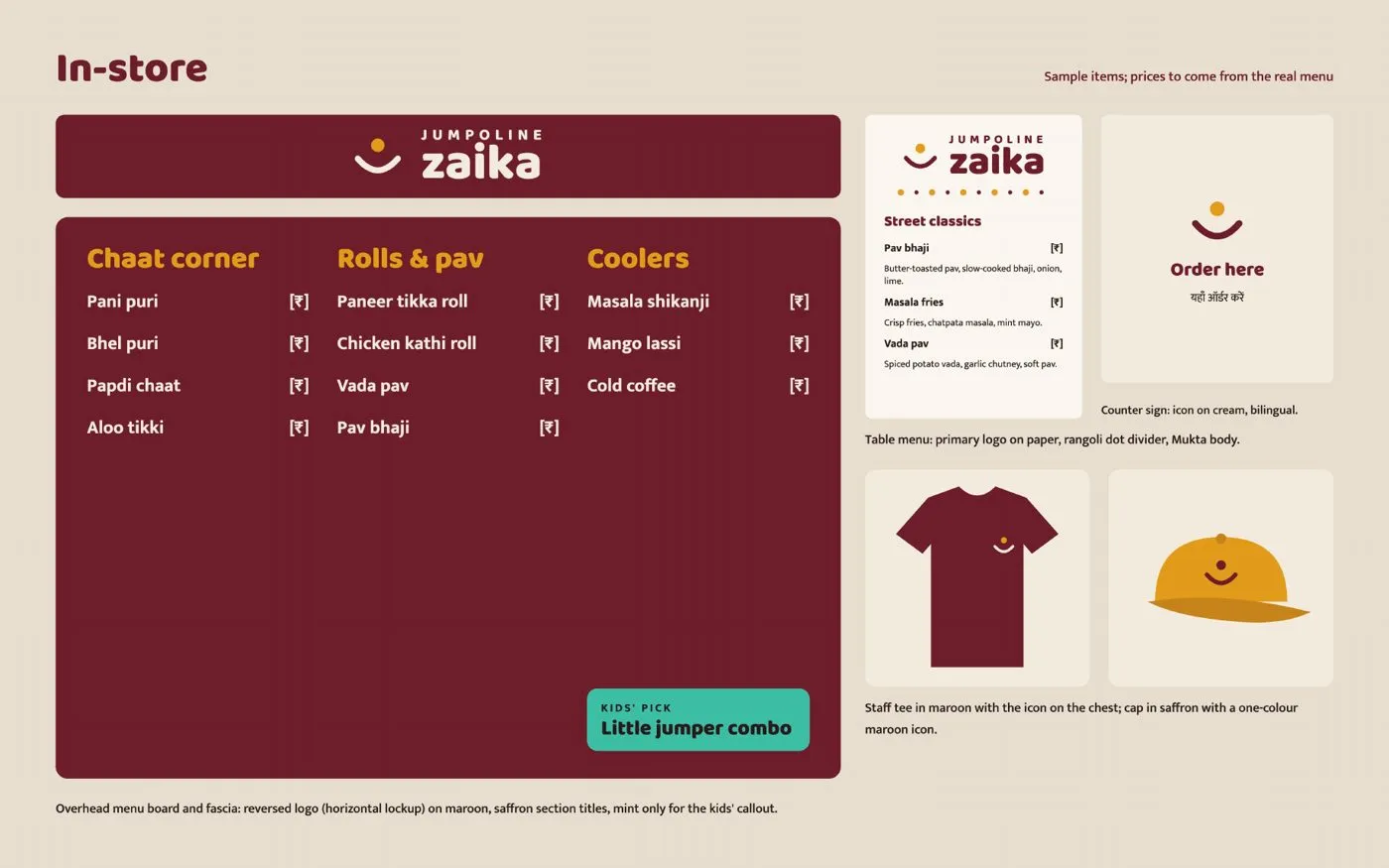
In store: the menu board and fascia, table menus, counter signs, staff tees and caps.
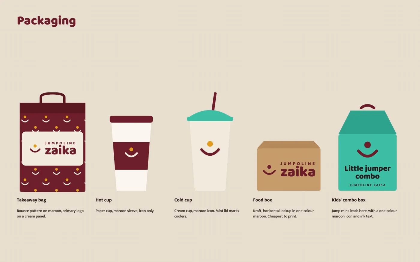
Packaging: takeaway bags, hot and cold cups, food boxes, and a kids’ combo box where the playful mint finally leads.
Digital: Instagram posts and stories, and Swiggy and Zomato banners using the horizontal logo, a dish photo and a short offer line.
Put it all on one brand board and anyone, a printer, a designer or a new manager, can apply it without asking.
Does this matter for advertising?
More than most owners think. On Meta, the creative does the targeting, and the brand is half of the creative. A restaurant with one recognisable colour, one font and one clear symbol gets remembered across a hundred ads; one that changes its look every post has to start from zero each time. We cover how creative now does the work targeting used to in what’s left of Meta targeting, and the formats that put a brand to work in 27 Meta ad formats you’ve never used.
Start with the name. Find one idea in it. Then let everything else grow from that one idea.
Ask me anything about this post
Frequently asked questions
What makes a good restaurant logo?
One clear idea that comes from the name, a wordmark people can read at a glance, no more than two colours, and a small icon that still works as a social avatar or a stamp on a cup lid.
What should a restaurant logo avoid?
The chef's hat with crossed fork and knife, badges crammed with text and stars, realistic food illustrations, gradients and shadows, and thin details that disappear at small sizes. These are what make most food logos look the same.
How many colours and fonts should a restaurant brand use?
Two or three core colours, one bright secondary colour kept for promotions and kids' items, and two font families: a display face for headlines and signs, and a quiet sans for menus and prices.
What is a restaurant design system?
Everything that grows from the logo: colour and font rules, logo versions for different spaces, patterns and icons, photography and tone of voice, and how all of it appears on menus, packaging, social posts and delivery apps.
Sources
- Restaurant logo inspiration board — Marxx AI, accessed 1 Nov 2026
Related reading
-
Andromeda 2.0, GEM and GenRecs: what Meta's ad AI means for creative
What Meta's ad systems Andromeda, GEM and generative retrieval actually do, what changed in 2026, and why distinct creative concepts now beat more ads.
-
Meta's creative diversity score: what Low, Medium and High mean
Ads Manager now rates each ad set's creative diversity as Low, Medium or High. How it is worked out, what it misses, and how much to care.
Ask this site
Answers are generated from published posts on this site only. Check the cited post before acting on anything.